Test Background
The goal of this test was to see what visitors were doing on the home page. Our main goal was to sign them up for the three free meditation videos and then lead them to the point of sale of the main product.
So, was the home page driving as much traffic to the free offer?
Original Page Design With Analytics Overlay

New Page Design +128% Signup Increase
- You can see there is a huge number of clicks on the home button. Yet this is the home page. Clearly, visitors have no idea they are on the home page!
- This is the main call to action to get people to sign up for three free meditation videos. 0.1% clearly this is not working
- Same here 0.1% clearly this 2nd button is also not working.
- Not that only 7% of clicks were below this line. In fact, that also includes the two main call to action buttons as well if you make the vertical height of the page smaller. Clearly, the buttons are not visible to most visitors.
- At least those that are members seem to find the members / courses pages OK!
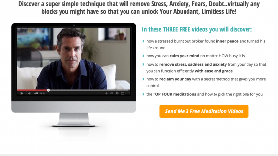
The Redesigned Home Page
- The new homepage will first inform visitors they are on the home page. We must lower the wasted clicks on Home button.
- Next, make sure that the site clearly states that it’s a meditation site. Previously, new visitors weren’t aware.
- Change the banner to be “about the three videos free offer”. Use Cookies so if someone has signed up for three free videos – they get a different banner.
- There’s no need for a split test as the numbers are so low that just looking at the clicks to the Three Free Videos new page we beat 0.1%!
New Home Page Mockup